Alignment + Repitition
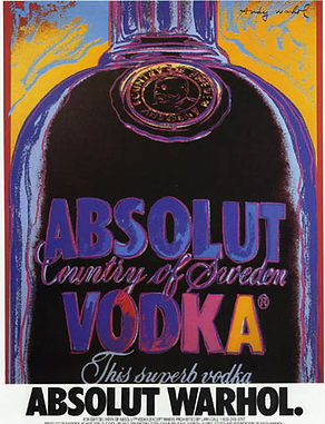
I picked the Absolut Vodka ad campaign from the 90s. Growing up, my mom subscribed to fashion magazines like Vogue, and I remember a family friend who collected Absolut ads because each one felt like a unique piece of art. Because of that, this campaign immediately came to mind when I was thinking about repetition and alignment.
The ads demonstrate repetition through the use of the iconic Absolut bottle shape and consistent branding. Even though the imagery changes from one advertisement to another, the bottle silhouette, logo, and overall design style remain recognizable. This repetition helps build a strong brand identity and makes the advertisement memorable.
The campaign also uses strong alignment to organize the visual elements and guide the viewer's eye. The text and imagery are positioned deliberately to create balance and draw attention to the advertisement's focal point. The alignment helps the design feel clean, cohesive, and easy to understand.
Ads courtesy of AbsolutAd.com